Tips on Writing a Thesis in LaTeX
Microtype
Microtype is one of the most notable packages I have ever used with LaTeX. It greatly improves general appearance of the text using different techniques, such as margin kerning (protrusion), extra kerning, expansion, tracking, and spacing (below I will briefly discuss these techniques, but I suggest to look at the microtype documentation and Hàn Thế Thành’s PhD thesis for the detailed description and examples). To see microtype "in action", compare distribution of the white space in the fragment of text processed by LaTeX without and with microtype:
% default - no microtype

\usepackage[...]{microtype}

The result of microtype activation can be better seen in the animated version of these two figures as well as in another animation with two blurred text fragments demonstrating the difference in "greyness" of text processed with and without microtype.
Obviously, microtype enables placing more words in the three text lines above — as a result, the total interword spacing is being decreased and at the same time is distributed more uniformly. For the reader not experienced with typesetting the difference between two text blocks in the example above may appear quite small; however, this difference, among other things, can result in a positive impression after looking at the document, even if the reader will not realize why exactly your text looks nice.
An important fact is that enabling microtype reduced amount of “under-” and “overfull box” warnings which LaTeX usually reports in the compilation logs. In other words, microtype allowed LaTeX to avoid situations when there is too much of the white space in a line, or, opposite, there is not enough space to place the text within the page margins. In the former case LaTeX produces large interword spacing, while the latter results in the words crossing the right margin (a good practice here is to use [draft] option of the \documentclass command to highlight such words/overfull boxes in the compiled document). Of course, the statements above are applicable to the text which is justified (i.e., aligned to the left and right margins).
Microtype has a plenty of settings (see documentation), and here are the ones I used:
\usepackage[activate={true,nocompatibility},final,tracking=true,kerning=true,spacing=true,factor=1100,stretch=10,shrink=10]{microtype}
% activate={true,nocompatibility} - activate protrusion and expansion
% final - enable microtype; use "draft" to disable
% tracking=true, kerning=true, spacing=true - activate these techniques
% factor=1100 - add 10% to the protrusion amount (default is 1000)
% stretch=10, shrink=10 - reduce stretchability/shrinkability (default is 20/20)
Further I discuss some of these settings, addressing customizations and minor issues (with corresponding solutions) experienced while working with microtype. Issues were mainly related to the cases where microtypographic techniques (protrusion, expansion, and etc.) did not work or worked not as expected.
Protrusion
Protrusion (margin kerning, hanging punctuation) enables characters to cross the margin edge in order to increase uniformity of the optical appearance of text boundaries (see pages 39–50 of Hàn Thế Thành’s dissertation). After activating protrusion with the option activate={true,nocompatibility} of microtype, crossing the margins is best seen for the characters having small area (".", ",", "-") or highly non-flat contour near the margin edge ("y", "r" near the right margin). This is illustrated in the figure below where comma and "r" cross the right margin edge indicated by the red dashed line:
% default - protrusion of normal-sized text but not superscripts
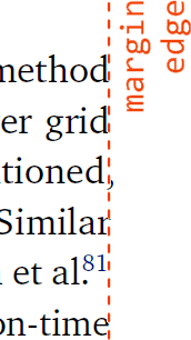
While the comma is clearly protruded in the figure above, this is not the case for the superscript "81", which does not cross the margin (while it should). Therefore, the next step was to activate protrusion for the superscript-sized text. In my thesis (almost) all superscrips in the main text (not in math mode) are bibliographic reference numbers. The code shown below is a modified example taken from the microtype documentation, and it enables protrusion of superscript numbers:
\SetProtrusion{encoding={*},family={bch},series={*},size={6,7}}
              {1={ ,750},2={ ,500},3={ ,500},4={ ,500},5={ ,500},
               6={ ,500},7={ ,600},8={ ,500},9={ ,500},0={ ,500}}
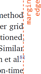
First line of the command above specifies font settings for which \SetProtrusion command will be activated (family={bch} stands for Bitsream Charter used for the main text font). Here I mention that although an asterisk ("*") means "any", I have experienced situations when this was not the case. For instance, \SetProtrusion with size={*} did not work for font sizes 6 and 7 (i.e., superscripts in my case), and I had to specify size={6,7} explicitly in order to get microtype acting on superscripts. Sometimes it is not easy to identify exact settings of each employed font while compiling a LaTeX document; a possible solution here is to check LaTeX .log files where the actual font settings (encoding, family, series, size) can be found.
Third and fourth lines define a protrusion amount for a particular character (0–9 digits in the example here). The numbers given in curly brackets after comma (750, 500, etc.) determine the protrusion amount of a given digit through the right margin edge (larger number will result in more "protruded" digit, with the reference value of 1000 denoting the digit width — that is why narrow digit 1 has larger value than other more wide digits). In my thesis superscripts always follow text of normal size, and therefore never cross the left margin edge (i.e., they never start a new line). In the code above, numbers in curly brackets before comma are omitted, and therefore superscript protrusion through the left margin edge is not activated.
Stretch- and shrinkability
Microtype has a great feature to shrink and stretch characters in individual text lines which provides additional flexibility for the distribution of the interword space among a paragraph. After package activation, the default value for shrinking and stretching is 20 (or 2%), and at first glance increasing this value has only one negative effect — visual distortion of characters, which is almost impossible to notice at few percent values. But while typesetting thesis with bitstream charter font and default settings of microtype (i.e. stretch=20,shrink=20), I found some text lines to be slightly blurred compared to their neighbors, which is illustrated below (notice a blur of the middle line):
% default microtype settings: stretch=20,shrink=20

This blur is a result of rasterisation of the vector characters on the discrete set of display pixels, and therefore will depend on several factors such as current magnification level in the program displaying output PDF file, screen resolution, employed OS, subpixel rendering (e.g. ClearType). On my system setup blurred lines occurred quite rarely, and were seen only at "fit visible/fit width" magnification levels (i.e., normal reading mode); the blur disappeared after zooming the corresponding line. After playing with microtype parameters, I found that shrink and stretch options causes this blur effect, and after reducing their values to 10 I did not observe blurred text lines anymore:
\usepackage[stretch=10,shrink=10]{microtype}

Kerning
Next microtype customization I used was an adjustment of additional (to the default) spacing around the following characters: en-dash, round brackets, and quotation marks. This was accomplished with \SetExtraKerning command which is active only when kerning=true.
Although kerning by itself is an adjustment of the spacing between pair of characters (so called kerning pairs), \SetExtraKerning changes spacing around only one character. Together with the corresponding settings of \SetExtraKerning, table below shows the spacing before (top row) and after (bottom row) activation of \SetExtraKerning (note the increase of spacing around quotation marks, brackets, and en-dashes):
\SetExtraKerning[unit=space]
    {encoding={*}, family={bch}, series={*}, size={footnotesize,small,normalsize}}
    {\textendash={400,400}, % en-dash, add more space around it
     "28={ ,150}, % left bracket, add space from right
     "29={150, }, % right bracket, add space from left
     \textquotedblleft={ ,150}, % left quotation mark, space from right
     \textquotedblright={150, }} % right quotation mark, space from left
The difference before and after adding extrakerning may appear quite smallnote that individual words are shown above, and
in case of full text lines the added spacing due to
\SetExtraKerning will be more pronounced, but non-optimal spacing was annoying every time I was reading the compiled document, and therefore modifications shown above were introduced.
First line in the command above activates extra kerning with reference unit length of space character ([unit=space]): kerning value of 1000 will add spacing with the length of one space. Second line specifies settings of the font to which kerning will be applied. As you could notice, with the chosen settings kerning will not affect text with "scriptsize" font size, and therefore en-dash appearing in the text superscripts will not gain additional surrounding space. Superscripts typeset in non-math mode in my thesis are used for citation numbers only (with corresponding ranges of numbers where en-dash actually appears), and the chosen strategy for the typesetting of citations was minimization of the space occupied by the citations: citation numbers have script size, there is no space after comma between citation numbers, and an additional spacing around en-dash is avoided, too:

This approach is quite common in the scientific literature — for example, it is used by recognized scientific journals such as Analytical Chemistry (figure, left) or Physics of Fluids (figure, right):

Going back to the \SetExtraKerning command, it acts on the characters sizing from "footnotesize" to "normalsize" (LaTeX font sizes). Last five lines specify the spacing values in a form of character_with_additional_spacing = {add_space_from_left, add_space_from_right} (similar to \SetProtrusion discussed above). As you see, target characters can be specified in different ways (see microtype documentation), and "28 ("29) is the hexadecimal character code for the round bracket of the Charter font; the code tables of other Charter characters can be found here.
Using aforementioned microtype command, I have experienced the following problem:
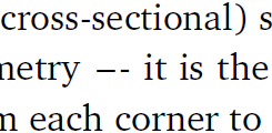
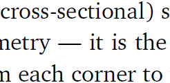
i.e., em-dash entered as --- in the original LaTeX code was split into two parts due to additional kerning around en-dash (which, in turn, was typed as --). I solved this problem using \textemdash{} command instead of ---. Characters {} at the end of command are required to force LaTeX to recognize (i.e., to add in the compiled document) the space following the \textemdash command. Here is the result:
Kerning for headings
As mentioned, TeX Gyre Heros font was employed to typeset headings in the document:
% default - no microtype

In the text fragment above I did not like positioning of the period (which is asymmetrical relative to the neighbouring characters "1" and "3") and "tight" location of en-dash. I have used microtype \SetExtraKerning to adjust this:
\SetExtraKerning[unit=space]
   {encoding={*}, family={qhv}, series={b}, size={large,Large}}
   {1={-200,-200},
    \textendash={400,400}}

This code adds negative spacing around character "1" resulting in a more symmetrical placement of the period between "1" and "3", and positive spacing around en-dash. From the last figure it appears that — even after additional negative kerning — location of the period can be optimized further, but please note that such alternation of spacing should be done with care because neighbors of a given character can have different width. Strictly speaking, such spacing adjustments have to be performed via modification of the kerning pairs, but I found this way to be too time consuming for my level of LaTeX knowledge at the time of thesis writing, and decided to stay with the simpler microtype-based solution.
Tracking
Typographic techniques applied by microtype are not desirable in some situations. For example, after enabling microtype with \usepackage[tracking=true]{microtype}, small caps (SC, small capital characters used to typeset author names in the cited literature) got an extra spacing around each SC character by default:
% default - microtype is on, SC tracking is on
Separating characters by additional spacing is shown as tracking, and its application to small caps is a common practice. While thesis writing, I have decided to avoid increased inter-character spacing show above:
\SetTracking{encoding={*}, shape=sc}{0}
As I see it now (thesis was written in 2010), small caps without tracking appear a bit dense and therefore should to be slightly separated. Here is a possible solution using small tracking value of 40 (which is 0.04 of 1 em):
\SetTracking{encoding={*}, shape=sc}{40}
All three figures above can be seen in their animated version.
Microtype documentation states that after tracking individual characters one may need an additional adjustment of the interword spacing. In my particular case of the Bitstream Charter font and zero/small tracking value this is not really neccessary, but in general such adjustment should be done using spacing option of \SetTracking.
Protrusion in ToC
Another case where microtype techniques should be avoided is protrusion in ToC (table of contents): page numbers on the right of a page should form a column with a flat right side. Protrusion of the page numbers through the right margin edge reduces visual flatness of this column and therefore should be avoided. Here are two number sets (page numbers of some sections and chapters) from the thesis ToC generated by LaTeX shown for the case of enabled protrusion:
% default - protrusion is ON
\tableofcontents % prints Table of Contents
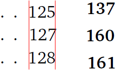
Notice the difference in a horizontal alignment of the numbers "127" (left) and "160" (right) relative to their top and bottom neighbors; thin red lines help to compare this horizontal alignment. Microtype documentation contains an example, which I used to disable protrusion in ToC. The result looks much better:
\microtypesetup{protrusion=false} % disables protrusion locally in the document
\tableofcontents % prints Table of Contents
\microtypesetup{protrusion=true} % enables protrusion
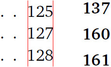
Protrusion should be also deactivated for the List of Tables and List of Figures if you have any.
page not just by fast scrolling the information presented on this web site, and would like to support development of this project you may consider buying me a coffee.


